
Using Dashboards For Monitoring PS Operations And Performance In NetSuite OpenAir
Reports and graphical views help us manage our services business. Dashboards can provide this on an on-demand basis.
- At an individual contributor level, dashboards and reports can communicate performance measures and workload for awareness.
- At an executive or management level, dashboards and reports can communicate operational performance, trending metrics, and staffing needs.
- Overall dashboards can help motivate better quality of information and more timely actions from the field.
Useful examples and tips for creating OpenAir dashboards
The dashboard tab of the Home module can hold both graphs and report portlets. Both graphs and report portlets require a defined NetSuite OpenAir report in order to display the information. Graphs include bar, area, line, and spline types. Report portlets simply display the report information in a portlet window but also provides the additional capability to filter by typing filter values in the field above each column:
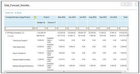
Dashboard reports provide a graphical view of NetSuite OpenAir report results. Useful examples of dashboards include
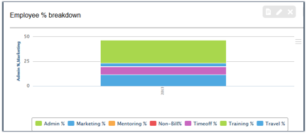
- Utilization line graph trending over time (perhaps each line is a department or region)
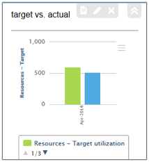
- Utilization comparison to target utilization using multi-bar charts
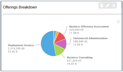
- Split of revenue earning by contract type or service offerings in a pie chart or donut chart
- Margin trending with an Area Spline graph
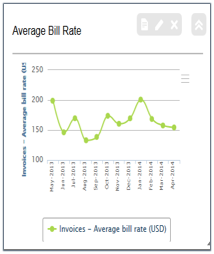
- Bill rate trending using a line graph trending over time
- An FTE demand bar chart in which each bar represents a type of resource
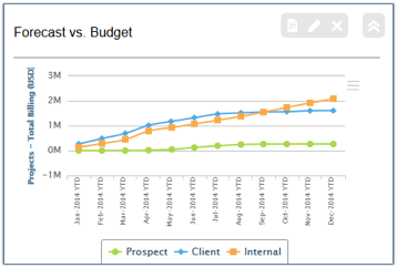
- Total revenue plan and progress to date and forecast against plan line charts
Dashboard charts can be created centrally and pushed out to users with the Bulk User Wizard.
Typical standard dashboard sets include
- Self-utilization view and achievement of target – pushed out to all billable users in the organization. This requires the configuration of reports with a filter set hardcoded to ‘self-view’ and shared with all users prior to dashboard sharing.
- Management dashboard sets including team utilization (billable and non-billable), margin trending by service offering, revenue earning by offering, and forecast
- Executive dashboard sets including key customer account revenue, profitability, revenue plan achievement, regional views, and forecast.
Sharing of dashboard charts provides a chart view standard to all users included in the push of dashboard information. However, central control stops as soon as the bulk user wizard action is complete. Users may choose to delete or modify their own charts without impacting the central charts set. Any changes to the central chart set, other than updating the underlying report configuration, will not be automatically replicated to end-users so change management communication is recommended.
A word of caution
Dashboard charts are not refreshed dynamically but refreshed by NetSuite OpenAir daily in an overnight process. To refresh any given report or chart, the user must edit the report portlet or dashboard and re-save to force a data display refresh.